 Tanvir
- Lead Product Designer
- Me leading two designers, with product and engineering
- Design audit · Design system · Client Portal · Tax Organizer · Financial Profile · Second pass
- 3 min
01/The project
One client journey, built as three products
TaxRise helps people settle tax debt with the IRS. Each case runs through three tools: the Client Portal for the case, documents and payments, the Tax Organizer for unfiled years, and the Financial Profile for the money details TaxRise negotiates with. Built on Salesforce at different times, they didn't feel like one product.
I led two designers through the rebuild that shipped. Then I went back over all three with fresh eyes. That second pass is a concept for now, and it's most of this page.
- 3 products
- 82 screens in the second pass
- Lead designer, team of 3
- The second pass is a concept
02/At a glance
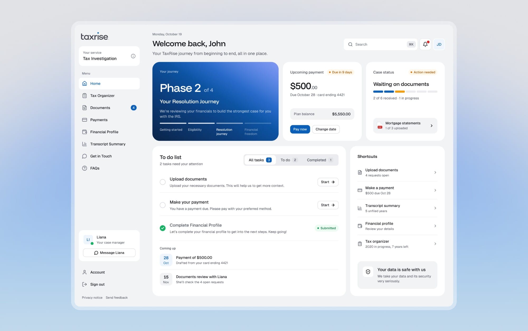
First question: where's my case?
The Client Portal home, and a few of the cards that carry the platform. Each one is the real component.
03/What shipped
The version that shipped
To a client it was one journey. On screen it was three products, each with its own buttons, inputs and cards. All three sat on Salesforce, which limited how far we could take the design. We wanted to own it, so we moved off Salesforce, audited every component side by side, and rebuilt the three on one design system.
From late 2025 into 2026 I led two junior designers. They ran the research and critiques and gathered feedback from the team. I built the design system, its guidelines and components, and set the visual direction for the Client Portal and the Financial Profile. They designed the remaining flows on that system.
The hardest call was the portal home. We wanted support chat, tickets and a detailed case status. Engineering had to build the infrastructure first, on a short timeline. So we shipped a simple case status up front and left the rest for later.
All three products shipped. Before, clients struggled to find their case status, their case manager and what they still had to do. Since launch, UX observation, surveys and feedback on calls show them finishing those tasks more confidently and more accurately. I have no numbers I can share.
Looking again, a few screens still made clients do the work. That's where the second pass started.
04/Second pass
Four places it still asked too much
Clients were still doing work we should have done for them: finding their own status, counting their own documents, digging for their own numbers.
05/One answer at a time
A lot to ask for, one answer at a time
Then there's the asking: a full year of tax details and a complete picture of someone's finances. My rule was to ask for the smallest thing first, and never make anyone type what we already know.
06/One system
Calm enough to trust with tax
My first direction looked like trendy SaaS: black cards, heavy shadows, mesh gradients. Wrong for tax. Five rounds of critique later, the system behind all three is plainer.
Flat white cards on a neutral grey, one gradient card per screen, and colour only where it means something: a status, a piece of data, or the one thing to press.
07/The screens
The screens, product by product
A few of the 82 screens in the second pass, one product at a time.
Where a client keeps track of their case
Eight unfiled years, one at a time
The money details, mostly confirmed rather than typed
08/What's next
What I'd want to measure
The redesign hasn't shipped, so there are no results to report yet. If it does, three numbers would tell me whether it worked: how many clients finish the Financial Profile in one sitting, how often uploads get sent back, and how many support questions are really asking where a case stands.
The first pass made three products feel like one. This one is about making that one product ask less of the people using it.